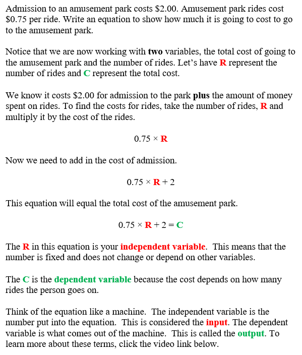
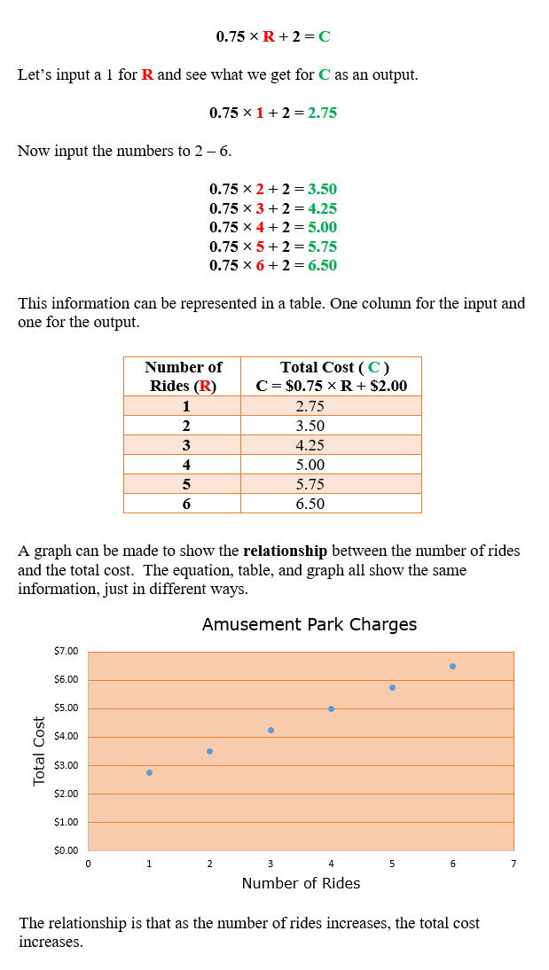
PDF File
GRAPHS
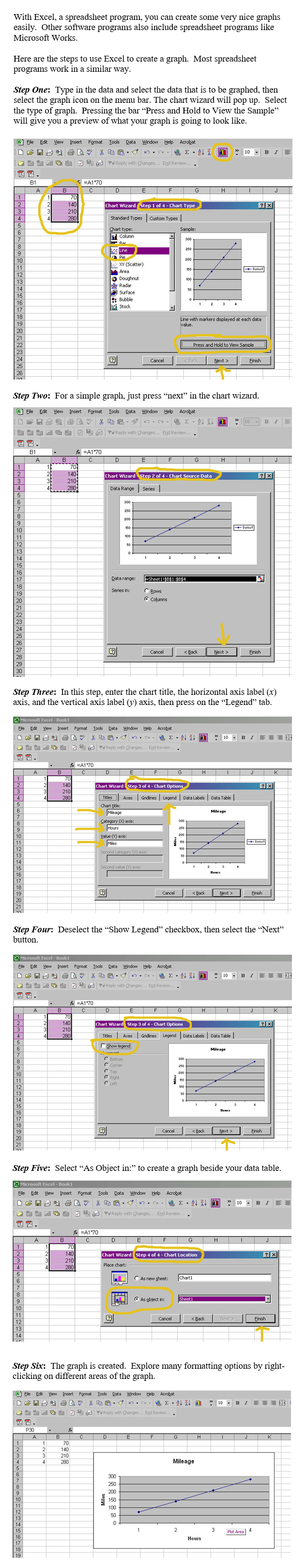
Tables, charts, and graphs may be used to show relationships between two variables. Some software programs, such as Microsoft Excel and Microsoft Works, have built‑in graphs or chart wizards that will help in constructing graphs. We will look at steps that demonstrate how to create a graph using Excel’s chart wizard so that we can analyze change of data over time and events. Every software program works a little differently, but generally follows the same principle for creating graphs.
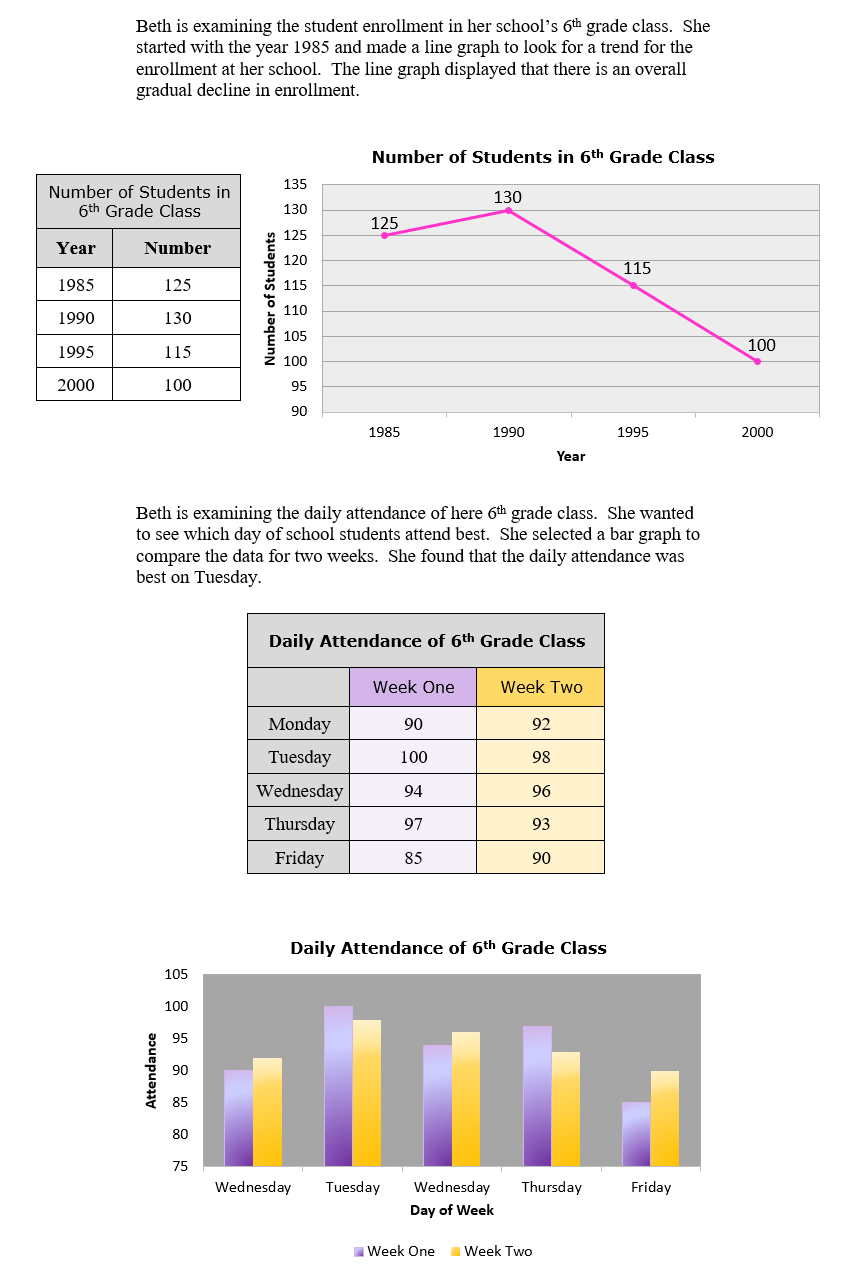
Graphs are used to display a graphic representation of data. We will look at line and bar graphs displaying the relationship between two variables. Line graphs are used to show growth or decline over a specified length of time. Bar graphs are used to compare amounts for each category.
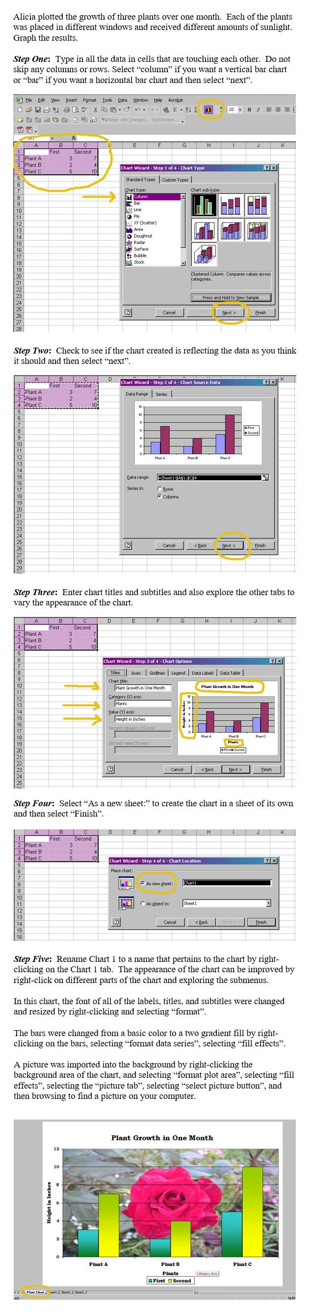
We will apply the use of Excel’s graph wizard to create a double bar graph where we compare two sets of data.
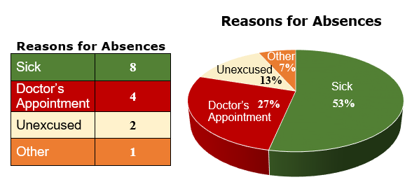
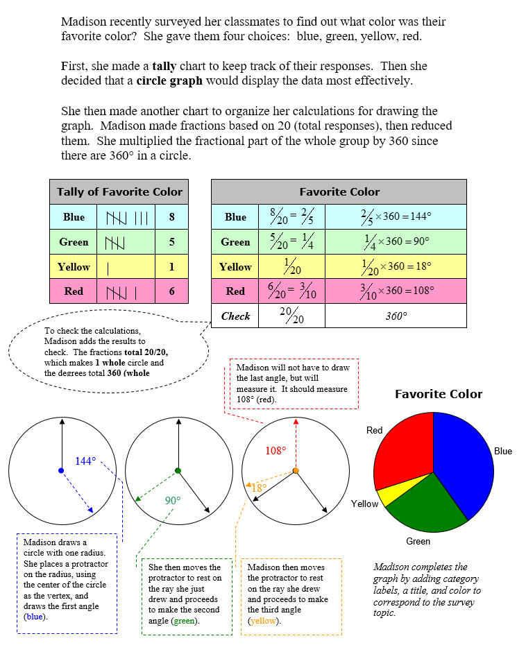
A circle graph is a graphical representation of a whole group of data divided up into parts. We will look at the details for constructing a circle graph where we start with a tally chart and then find the fractional part of the whole each category represents along with angle for each section of the graph.
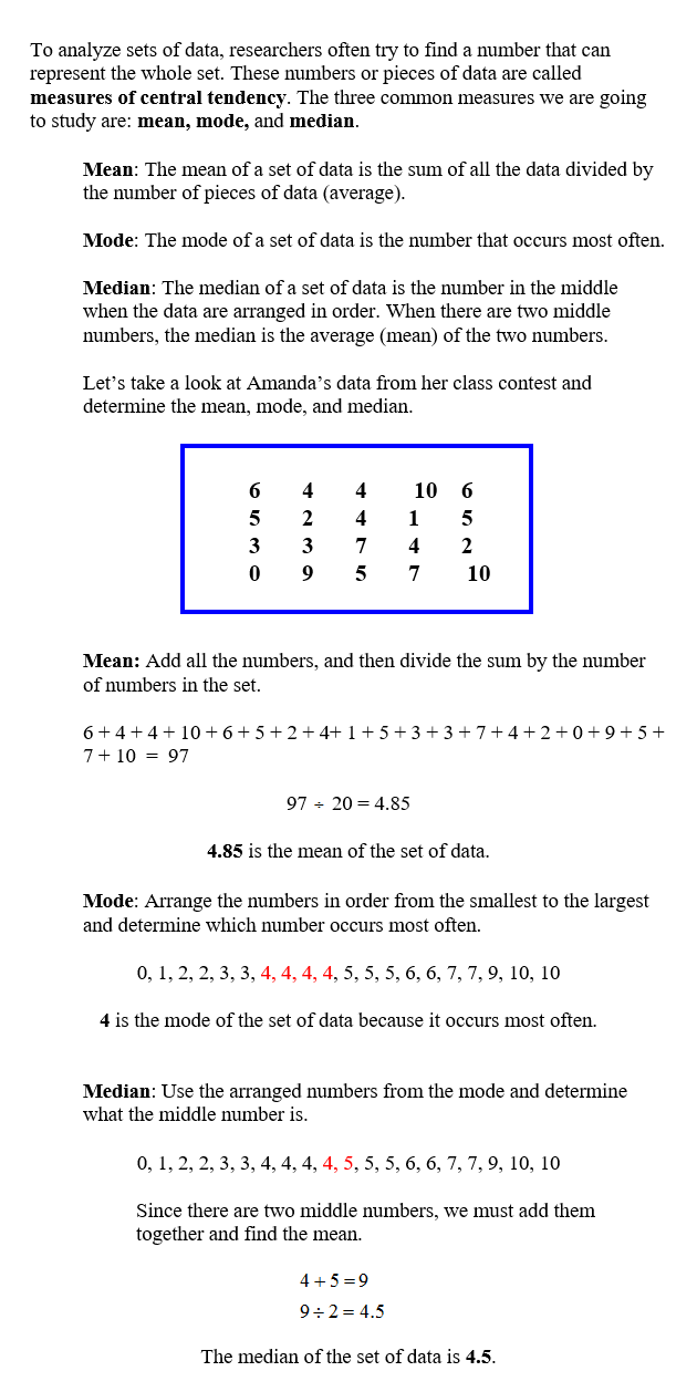
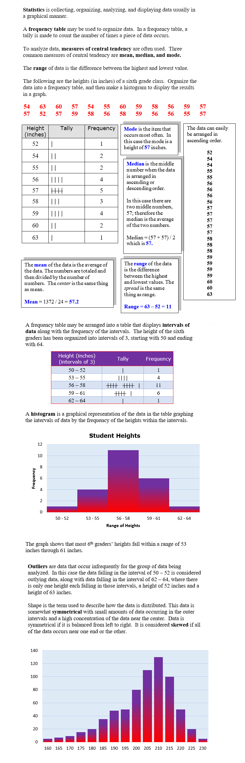
Measures of central tendency: mean, mode, median and range, are often used with collecting data and then displaying it in a graphic representation such as a histogram. A histogram is a special bar graph that is created from a tally chart of data that is organized into intervals. The tally is compiled into a frequency and then the graph is drawn using bars to represent the intervals.
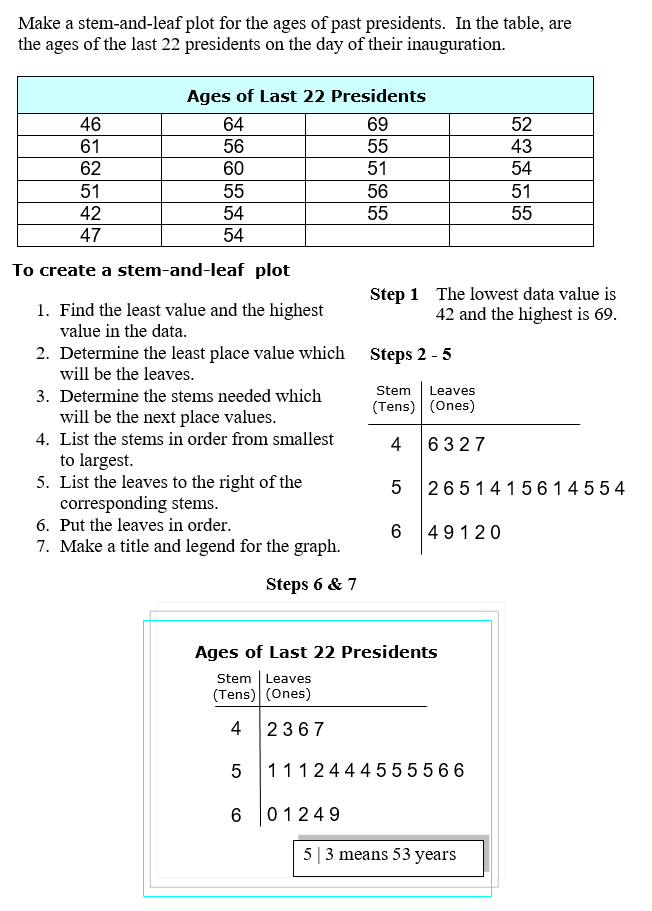
Stem and leaf plots are used to organize data so that all pieces of the data can been seen quickly and in an organized format. The stems and leaves are based on place value of the data.
Graphs of Relationships between Two Variables
 Input and output (02:01) Input and output (02:01) |
To review this section, click on the video below.
Cost Function (07:13) |
Using Technology to Graph Data
Line and Bar Graphs
Comparing Change in Growth of Plants By Creating a Double Bar Chart with Excel
Circle Graphs
Constructing a Circle Graph
Measures of Central Tendency
Statistics and Histograms
Stem-and-Leaf Plot