PDF File
ANALYZING DATA WITH GRAPHS
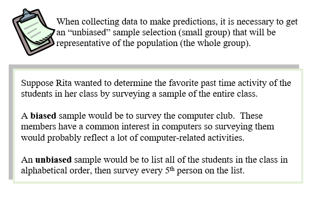
SAMPLING
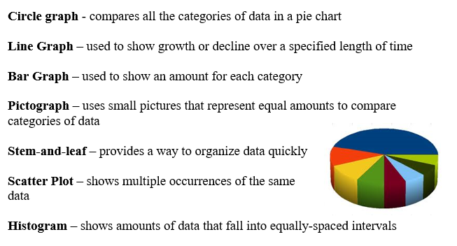
Graphs are visual ways to summarize data. Some data is better displayed in a circle graph, while other data is most effectively displayed in a line graph. We’ll first look at a summary of the types of graphs, and the type of data for which they are suitable.
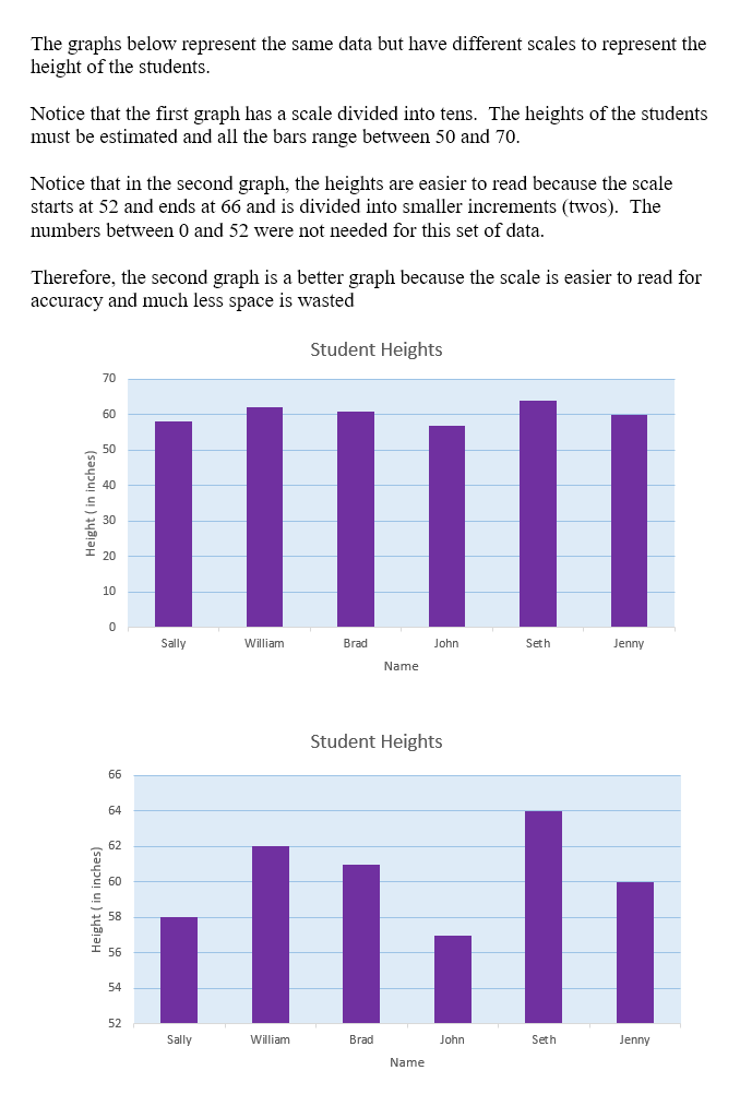
A graph is more effective when a scale is used that depicts data most efficiently. A well-matched scale makes the graph easier to read and interpret. We will examine ways to increase the effectiveness of displaying data in graphs by choosing the “right scale”.
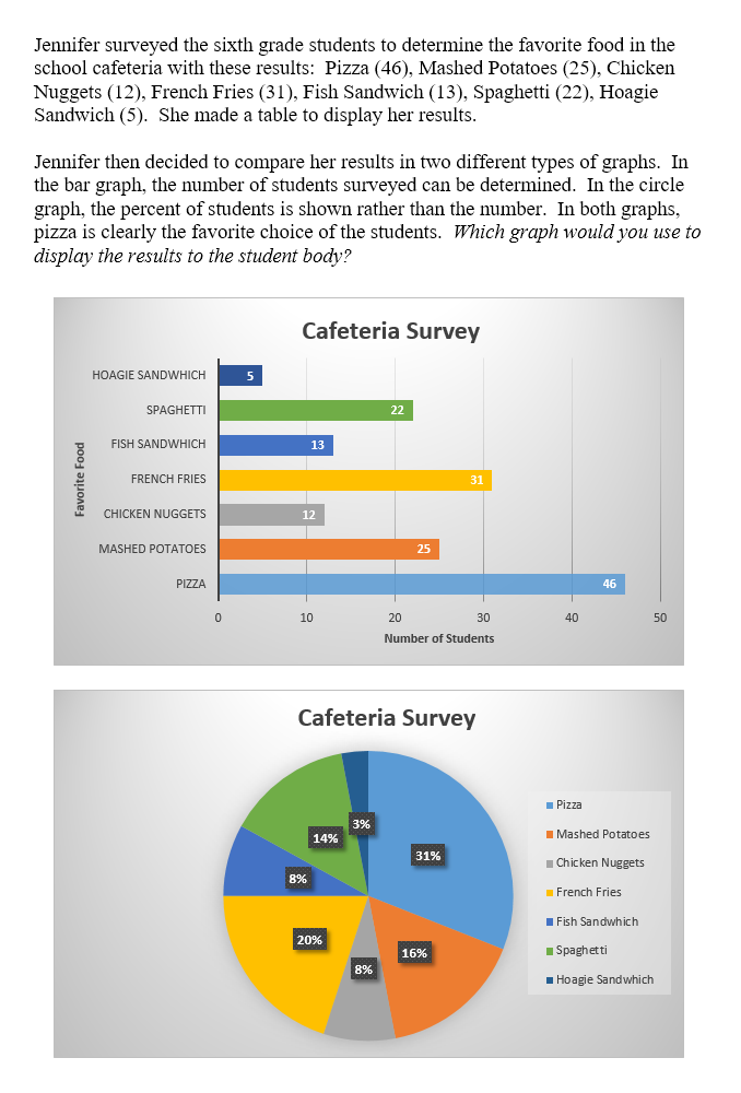
Different types of graphs can display the same data but used to support opposing arguments. We will examine the same data displayed in different two different types of graph.
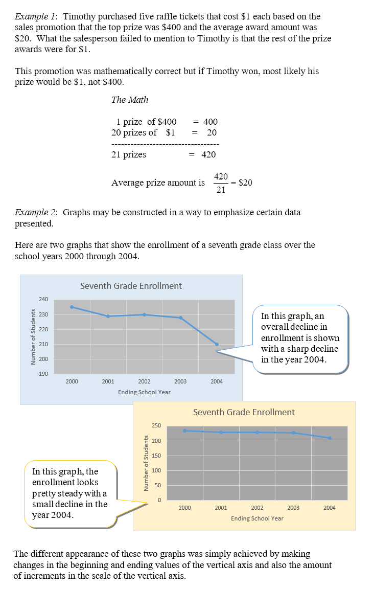
Graphs and statistics can be used to mislead interpretations of the real data by only telling part of the story or by using pictures that disguise the actual data. We will examine misleading graphs that have subtle attributes that bias the interpretation of the data.
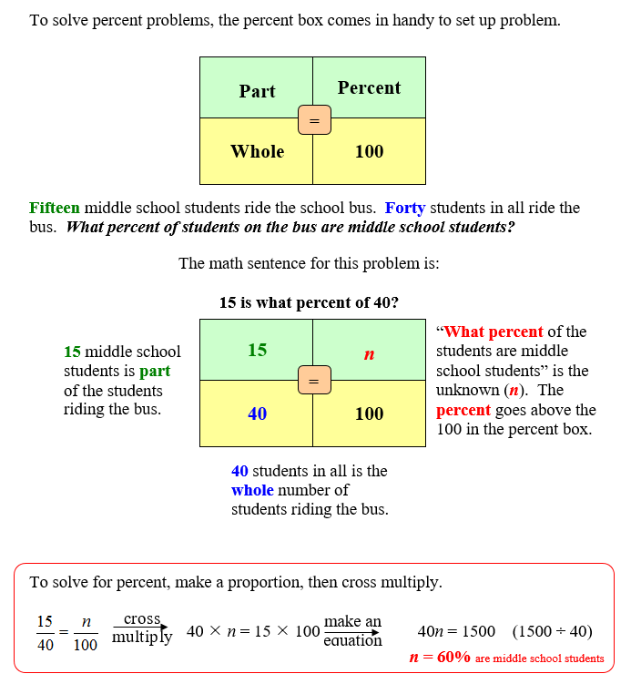
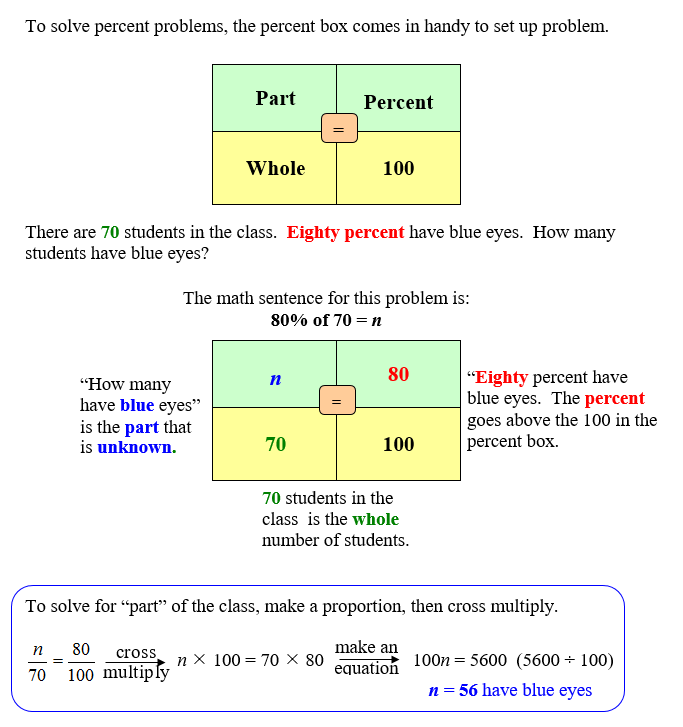
Sampling is way to use statistics that give predictions of total amounts when the number is too large to count or impossible to count. Sampling may be used to determine wild animal populations, numbers of fish in bodies of water, or numbers of defective units in mass production of manufactured items. You will use percent to investigate sampling data. We will review finding percent and finding part (percent of a number).
Types of Graphs for Display
Choosing the Right Scale
Same Data in Different Graphs
Misleading Statistics
Comparing Samples
Finding Percent
 Percentage of the Whole Percentage of the Whole |
The Britannica login and password may be required for some of the activities.
Login: vla Password: student |
|
Finding Part
 |
|
| Wholes and Parts |
|