Measures of Central Tendency
|
|
|
| |
| 1) Why are graphs important?
|
|
4000 character(s) left
Your answer is too long. |
|
| |
|
| 2) Define the mean of a set of data and explain how to find it.
|
|
4000 character(s) left
Your answer is too long. |
|
| |
|
| 3) Define the median of a set of data and explain how to find it.
|
|
4000 character(s) left
Your answer is too long. |
|
| |
|
| 4) Define the mode of a set of data.
|
|
4000 character(s) left
Your answer is too long. |
|
| |
|
| 5) Define the range of a set of data.
|
|
4000 character(s) left
Your answer is too long. |
|
| |
|
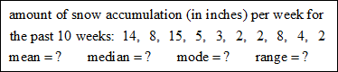
| 6) State the mean, median, mode, and range for the set of data.

|
|
4000 character(s) left
Your answer is too long. |
|
| |
|
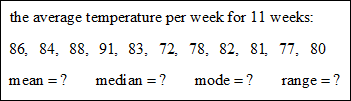
| 7) State the mean, median, mode, and range for the set of data.
Hint: Start by listing the numbers in order from the least to the greatest.
|
 |
4000 character(s) left
Your answer is too long. |
|
| |
|
| 8) State the mean, median, mode, and range for the set of data.
Hint: Start by listing the numbers in order from the least to the greatest.
|
 |
4000 character(s) left
Your answer is too long. |
|
| |
|
| |
| 9) Create a dot plot by hand (not using technology) for the following scenario: A group of students are asked how many movies they have seen in the last 6 months. Their answers are as follows:
0, 4, 6, 10, 9, 4, 5, 0, 1, 4, 8, 10, 4, 0, 2, 4, 6, 3, 7, 4, 8, 4, 1, 2, 4.
Attach your dot plot with the prompt provided.
|
|
20000 character(s) left
Your answer is too long. |
|
|
Attachments |
|
| |
| 10) Describe a histogram.
|
|
4000 character(s) left
Your answer is too long. |
|
| |
|
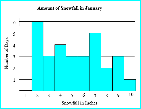
Refer to the histogram to answer the next four questions.
The graph shows the amount of inches of snowfall recorded per day.
(For example, 5 inches of snow was recorded for 3 days of the month.)
|
 |
|
| |
| |
|
| 12) What amount of snowfall was recorded most often on a daily basis?
|
|
|
|
| |
|
| |
|
| |
|
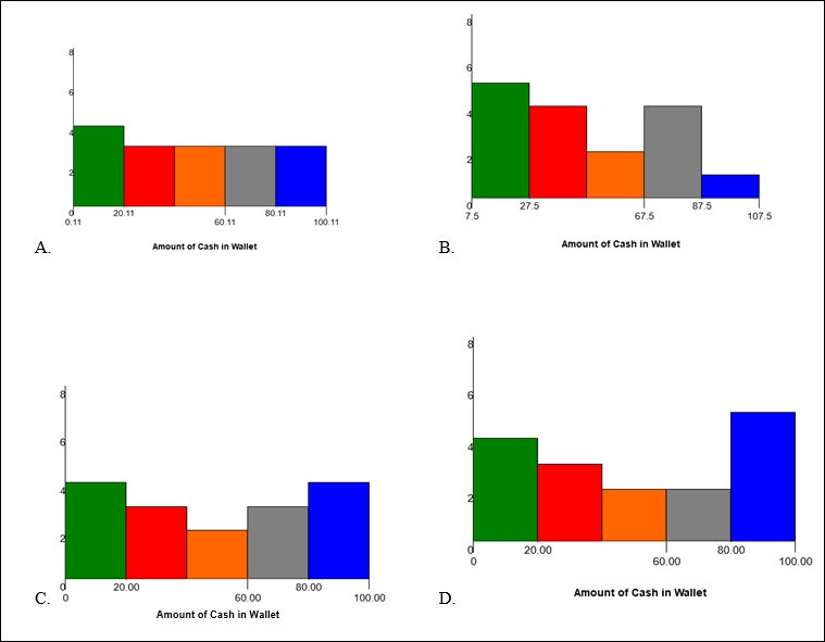
| 15) 16 people were asked how much cash they had in their wallet at a specific time. The data collected was as follows: 16, 5, 13, 12, 31, 32, 24, 47, 42, 77, 67, 61, 87, 81, 93, 87. Which histogram correctly represents the data?
|
 |
|
|
| |
|
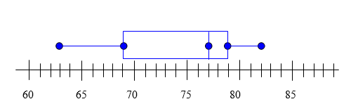
Box-and-whisker Plot
Use the box-and-whisker plot to answer the following questions.
|
 |
|
| |
| |
|
| |
|
| |
|
| |
|
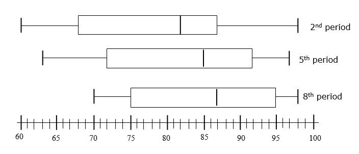
The box-and-whisker plots represent the test scores for the Chapter 9 test in three of Mrs. White’s Algebra I classes. Use the plots to answer the next five questions.
|
 |
|
| |
| |
|
| |
|
| |
|
| 23) Which classes have the same interquartile range?
|
|
4000 character(s) left
Your answer is too long. |
|
| |
|
| 24) Which statement is true?
|
|
|
|
| |
|
| 25) Create a box-and-whisker plot by hand (not using technology) based on the following data. You will need to attach it. Also, type in the box or write on your histogram, specifically, the values you found for the median, lower quartile, upper quartile, lower extreme, upper extreme, and IQR (interquartile range). Also, list any outliers you found.
Data for box-and-whisker: 20, 15, 45, 33, 19, 30, 31, 32, 31, 30, 27, 34, 50, 22, 29, 30
|
|
20000 character(s) left
Your answer is too long. |
|
|
Attachments |
|
| 26) If you were directed by your school to complete Offline Activities for this course, please enter the information on the Log Entry form. |
|
| No offline activities found |
0 Hour(s) & 0 Minute(s)
|
|
|
Attachments |
|