Displaying Data in Appropriate Graphs
For each of the data listed in questions #1 – #3, draw a graph on paper that matches the type of data given, and then answer the questions.
|
|
|
| |
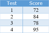
| 1) Jimmy’s Test Scores in Math – Is he improving?
a. Describe the graph by stating which type of graph you chose and why you chose that type of graph,
b. Does the graph show that Jimmy’s test scores are improving?
c. Justify your answer by explaining your interpretation of the display of data in the graph.
|
 |
20000 character(s) left
Your answer is too long. |
|
|
Attachments |
|
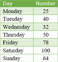
| 2) Videos Plus Movie Rental – Videos rented by day – Which day would be the best day of the week to be closed?
a. Describe the graph by stating which type of graph you chose and why you chose that type of graph,
b. Which day would be the best day of the week to close the store?
c. Justify your answer by explaining your interpretation of the display of data in the graph.
|
 |
20000 character(s) left
Your answer is too long. |
|
|
Attachments |
|
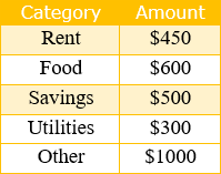
| 3) Sarah’s Family’s Monthly Income – Compare the categories?
a. Describe the graph by stating which type of graph you chose and why you chose that type of graph,
b. Which two categories together represent about the same amount as the “Other” category?
c. Justify your answer by explaining your interpretation of the display of data in the graph.
|
 |
20000 character(s) left
Your answer is too long. |
|
|
Attachments |
|
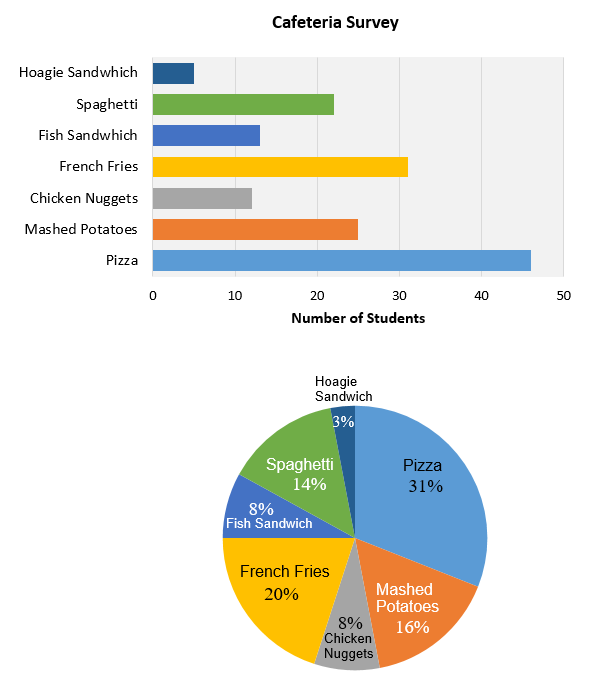
Use the scenario and graphs to answer questions #4 – #8. Jennifer surveyed the sixth grade students to determine the favorite food in the school cafeteria with these results: Pizza (46), Mashed Potatoes (25), Chicken Nuggets (12), French Fries (31), Fish Sandwich (13), Spaghetti (22), Hoagie Sandwich (5). She made a table to display her results. Jennifer then decided to compare her results in two different types of graphs, a bar graph and a circle graph.
|
 |
|
| |
| 4) Which graph is more effective in showing a relationship between the most popular and the least popular food items? Justify your answer.
|
|
20000 character(s) left
Your answer is too long. |
|
|
Attachments |
|
| 5) Which graph is more effective in showing the actual number of students who chose pizza as the most favorite food item?
|
|
20000 character(s) left
Your answer is too long. |
|
|
Attachments |
|
| 6) Which graph is easier to read to display the students’ favorites and why? |
|
20000 character(s) left
Your answer is too long. |
|
|
Attachments |
|
| 7) If you were making a presentation to the school principal to convince him that the Hoagie Sandwich should be replaced with another food item choice, which graph would you display and discuss with him? Justify your choice.
|
|
20000 character(s) left
Your answer is too long. |
|
|
Attachments |
|
| 8) Why wouldn’t a line graph be a good choice for this type of data?
|
|
20000 character(s) left
Your answer is too long. |
|
|
Attachments |
|
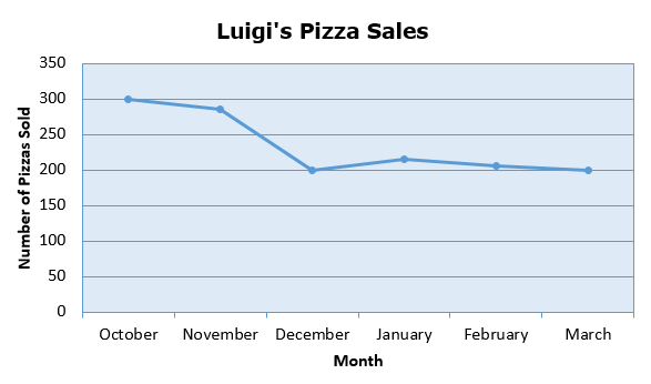
Luigi is considering the success of his business. Study the graph below and then answer questions #9 – #10.
|
 |
|
| |
| 9) Predict his sales for April. Justify your answer.
|
|
4000 character(s) left
Your answer is too long. |
|
| |
|
| 10) What might Luigi do to insure an increase in sales for April?
|
|
4000 character(s) left
Your answer is too long. |
|
| |
|
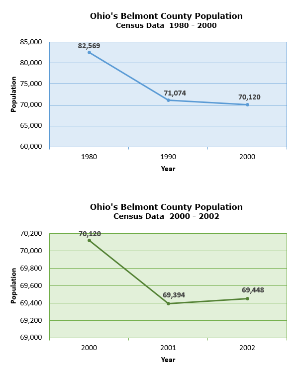
Study the two graphs and then answer questions #11 and #12.
|
 |
|
| |
| 11) What do you predict the population will be for 2003? Give a reason for your prediction.
|
|
20000 character(s) left
Your answer is too long. |
|
|
Attachments |
|
| 12) What do you predict the population will be for 2010? Give a reason for your prediction.
|
|
4000 character(s) left
Your answer is too long. |
|
| |
|
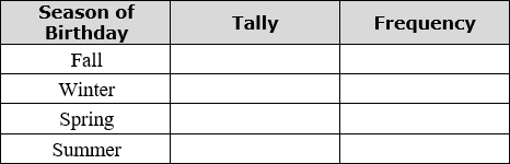
Conduct an Internet search to find the month when twelve famous people were born. You may choose from the following groups: favorite actors, music artists, or famous historical people.. Use the data you gathered to solve problems #13 and #14.
|
|
|
| |
| 13) Organize the data in the following chart. State the frequency for each season in the order given.
Printable Frequency Chart
|
 |
20000 character(s) left
Your answer is too long. |
|
|
Attachments |
|
| 14) Make a graph of the data on paper. Choose the appropriate type. Describe the graph and why you chose this type of graph.
|
|
20000 character(s) left
Your answer is too long. |
|
|
Attachments |
|
| 15) The movie theater has a list of movie tickets sold every day for the past week. Create a box-and-whisker plot of the data. Please attach a hand drawn or computer made graph. 156, 140, 168, 199, 142, 250, 187
|
|
20000 character(s) left
Your answer is too long. |
|
|
Attachments |
|
| 16) Using the graph from the previous problem, what is the lower quartile?
|
|
4000 character(s) left
Your answer is too long. |
|
| |
|
| 17) What is the median of the movie ticket sales?
|
|
4000 character(s) left
Your answer is too long. |
|
| |
|
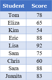
| 18) There are nine students in Ms. Garcia’s math class. Their scores on the last quiz are listed in the chart.
a. What is the range of the data?
b. What is the median of the data?
c. What is the mode of the data?
d. What is the mean of the data? Round answer to the nearest tenth, when appropriate.
|
 |
4000 character(s) left
Your answer is too long. |
|
| |
|
| 19) Erin wants to make a circle graph to represent a typical day of activities. She includes 7 hours of sleeping, 1 1/2 hours of eating, 7 hours of school, 2 hours of basketball, 2.5 hours of homework, and 2 hours of other activities. Will her circle graph be accurate? Why or why not?
|
|
4000 character(s) left
Your answer is too long. |
|
| |
|
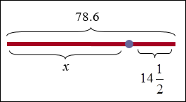
| 20) Write an equation for the drawing, then solve.
|
 |
4000 character(s) left
Your answer is too long. |
|
| |
|
| 21) Roberta’s home is 200 miles from her grandma’s house. She is traveling to see her grandma. She stopped for lunch after traveling three-fourths of the way. How many more miles does she have to travel?
|
|
4000 character(s) left
Your answer is too long. |
|
| |
|
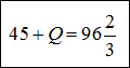
| 22) Solve for Q.
|
 |
4000 character(s) left
Your answer is too long. |
|
| |
|
| 23) Solve for k. 62.34 = k – 10.7
|
|
20000 character(s) left
Your answer is too long. |
|
|
Attachments |
|
| 24) Solve for b.
|
 |
20000 character(s) left
Your answer is too long. |
|
|
Attachments |
|
| 25) Describe all whole numbers that will make this inequality true.
9c < 70
|
|
4000 character(s) left
Your answer is too long. |
|
| |
|
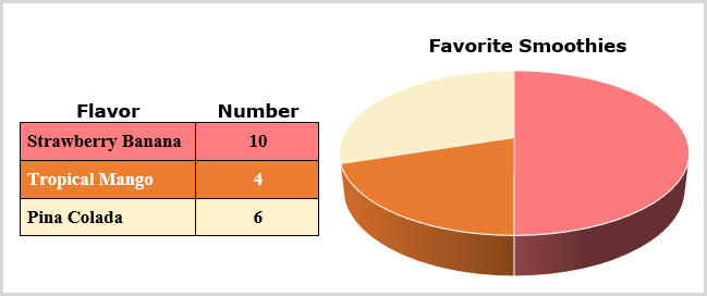
| 26) Elena surveyed her classmates to find out what flavor “smoothie” they would prefer. Study the chart and graph and then answer all questions.
a. Which is the correct portion and color for the strawberry/banana smoothie – “pink, 25%” or “pink, 50%”?
b. Which is the correct portion and color for the tropical mango smoothie – “gold, 20%” or “gold, 25%”?
c. Which is the correction portion and color for the pina colada smoothie – “cream, 20%” or “cream, 30%”?
|
 |
20000 character(s) left
Your answer is too long. |
|
|
Attachments |
|
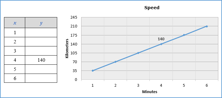
| 27) Study the graph. Print out the table and complete it using the data in the graph. Rewrite the following statement by filling in the blanks. The constant rate of change displayed in the graph is ____________ kilometers per ________________.
Printable Table
|
 |
20000 character(s) left
Your answer is too long. |
|
|
Attachments |
|
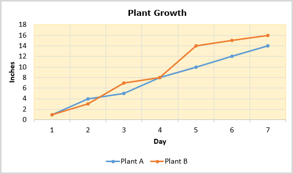
| 28) Study the graph, and then answer the questions.
a. Bean plant B grew the greatest amount of inches between which two days?
b. Which bean plant’s growth was constant between days 4 through 7?
c. On which day were both plants height the same?
|
 |
20000 character(s) left
Your answer is too long. |
|
|
Attachments |
|
| 29) If you were directed by your school to complete Offline Activities for this course, please enter the information on the Log Entry form. |
|
| No offline activities found |
0 Hour(s) & 0 Minute(s)
|
|
|
Attachments |
|