|
Some of the questions in this unit may be answered by recording an audio file. If you chose to record the answer, click on the Add Recording button and follow the on-screen instructions closely. Once you have completed and attached the recording, enter the word “COMPLETE” in the text box. (Note: If your computer does not have a built-in microphone, a microphone or microphone/headset combination is needed to record audio.) |
|
|
| |
| |
|
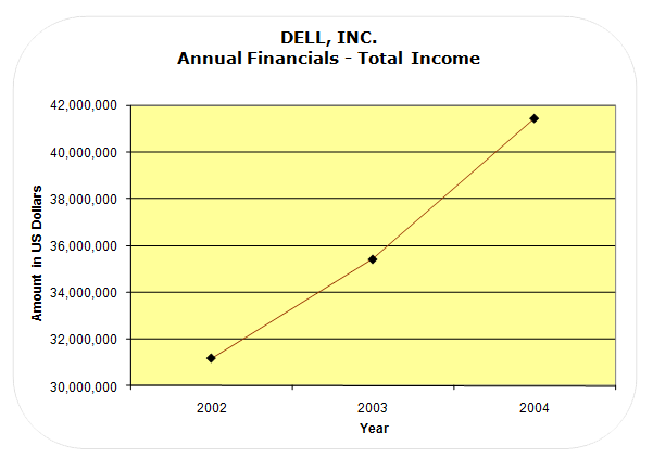
Dell Incorporated is a premier provider of products and services for customers worldwide to build their information-technology and Internet infrastructures. The line graph that is shown below displays Dell’s annual revenue from 2002 through 2004. Refer to the graph to answer the next four questions. |
 |
|
| |
| 1)
Approximately how much increase in income occurred from 2002 to 2003? |
|
|
|
| |
|
| 2)
During which years did more growth in income occur? |
|
|
|
| |
|
|
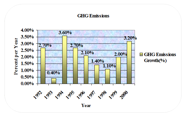
The chart below shows the rate of Canada’s Greenhouse Gas Emission (GHG) from 1992 through 2000. Refer to the chart to answer the next three questions. |
 |
|
| |
| 3)
What is the general trend in the GHG emissions for the years 1994 through 1998? |
|
|
|
| |
|
| 4)
Which year should probably not be included in determining the average percent of yearly GHG emissions when giving a generalized report of the GHG Emissions Growth? |
|
|
|
| |
|
|
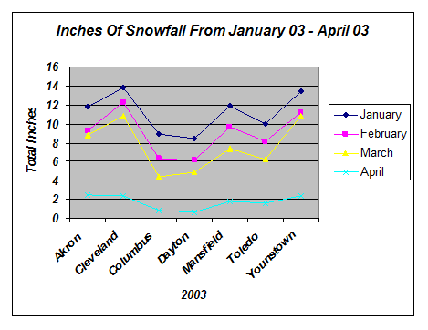
The line graph shown below displays the total inches of snowfall in Ohio cities for January through April in 2003. Use the line chart below to answer the next four questions. |
 |
|
| |
| |
|
| |
|
| 7)
Study the map of Ohio and compare each city’s location and the amount of snow it receives in the chart above. In the northern hemisphere, generally the further north a city is located, the more snowfall it receives. Due to “Lake Effect Snow”, one of the northern cities in Ohio has less snow than many of the cities that are located south of it. Which city receives less snow than many cities located south of it?
|
|
|
|
| |
|
| |
| 8)
Which gender leads in most categories? |
|
|
|
| |
|
| 9)
Which degree is attained by most people in the United States who have degrees? |
|
|
|
| |
|
| |
|
| 11)
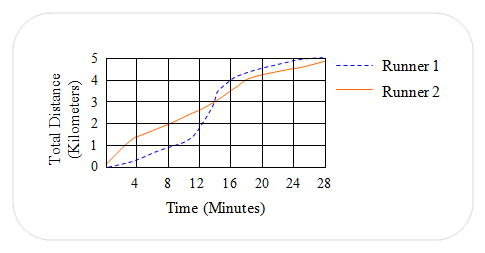
The distances covered by two runners during a race are shown in the graph below. How long after the start of the race did one runner pass the other? |
 |
|
|
| |
|
| |
| |
| |
|
| |
|
| |
|
| |
|
| |
|
| |
|
| 18)
Are there any outliers? |
|
|
|
| |
|
|
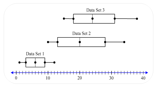
Refer to the box-and-whisker graphs shown below to answer the next three questions. |
 |
|
| |
| 19)
The values given below match which data set? |
 |
|
|
| |
|
| 20)
The values given below match which data set? |
 |
|
|
| |
|
| 21)
The values given below match which data set? |
 |
|
|
| |
|
|
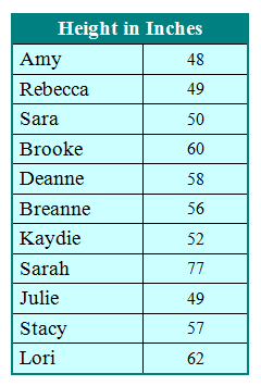
The table below shows the height in inches of eleven girls on the Shamrock High School basketball team. From the given data, create a stem and leaf plot, and then answer the next thirteen questions.
Click to view the chart in a pop-up window.
|
 |
|
| |
| 22)
What is the median height (in inches) of the girls? |
|
|
|
| |
|
| 23)
What are the lower and upper quartiles? |
|
|
|
| |
|
| 24)
What is the interquartile range? |
|
|
|
| |
|
| 25)
Which data points are the extreme values? |
|
|
|
| |
|
| 26)
What values are the limits for determining if a data point is an outlier? |
|
|
|
| |
|
| 27)
Which data point is the outlier? |
|
|
|
| |
|
| 28)
Print out or copy the number line shown below and make a box-and-whiskers plot of the heights of the Shamrock High School girls’ basketball team. Describe the box-and-whiskers plot in detail by referencing the description of the graph and the location of the following data points: the upper and lower extremes, the median, the upper and lower quartile values, and the outlier. |
 |
20000 character(s) left
Your answer is too long. |
|
|
Attachments |
|
|
Now let’s examine the data about the heights of the Shamrock High School girls’ basketball team excluding the outlier. |
|
|
| |
| 29)
What is the median height (in inches) excluding the outlier? (In other words, don’t include the outlier in the data set.) |
|
|
|
| |
|
| 30)
What are the lower and upper quartiles excluding the outlier? |
|
|
|
| |
|
| 31)
What are the extremes excluding the outlier? |
|
|
|
| |
|
| 32)
Print out or copy the given number line again and make a box-and-whisker plot of the same data but exclude (don’t include) the outlier in the box-and-whiskers. Describe your box-and-whiskers plot in detail by referencing the upper and lower extremes, the median, and the upper and lower quartile values. |
 |
20000 character(s) left
Your answer is too long. |
|
|
Attachments |
|
| 33)
What is an advantage of considering the outlier as a separate piece of data when analyzing and graphing data? |
|
4000 character(s) left
Your answer is too long. |
|
| |
|
| 34) If you were directed by your school to complete Offline Activities for this course, please enter the information on the Log Entry form. |
|
| No offline activities found |
0 Hour(s) & 0 Minute(s)
|
|
|
Attachments |
|