|
Some of the questions in this unit may be answered by recording an audio file. If you chose to record the answer, click on the "Add Recording" button and follow the on-screen instructions closely. Once you have completed and attached the recording, enter the word “COMPLETE” in the text box. (Note: If your computer does not have a built-in microphone, a microphone or microphone/headset combination is needed to record audio.) |
|
|
| |
|
Measures of Central Tendency |
|
|
| |
| 1)
What is the mean, median, and mode for the following data set: {63, 24, 82, 46, 50, 92, 85, 46, 74, 37}? Round the answer to the nearest tenth, if needed. |
|
4000 character(s) left
Your answer is too long. |
|
| |
|
| 2) Ten people donated money to a local school charity. One donated $201 and the remaining people donated $1 each. Calculate the mean, median, and mode. (a) State the mean, median, and mode giving both the term and the amount. (b) Which measure of central tendency should not be used to represent the general donation made to the school charity and why? |
|
4000 character(s) left
Your answer is too long. |
|
|
Attachments |
|
| |
|
| |
|
| Frequency Tables and Histograms |
|
|
| |
| 5) Devon surveyed his classmates to find out in what month they were born. The results are shown below. Complete the frequency chart by organizing the responses into the given ranges in the chart. What was the frequency of (a) January – March, (b) April – June, (c) July – September, and (d) October – December? |
 |
4000 character(s) left
Your answer is too long. |
|
| |
|
| 6) The histogram below shows thirty students’ weekly allowances. (a) What range of allowance was given to the highest number of students? (b) How many students received the highest allowance? |
 |
4000 character(s) left
Your answer is too long. |
|
| |
|
| 7) How would the distribution in the previous problem be described? |
|
|
|
| |
|
| 8) The NFL Team Payrolls for 2009 are graphed in the histogram below. How many teams have a payroll of between $110 million and $130 million? |
 |
|
|
| |
|
| 9) How would the distribution in the previous problem be described? |
|
|
|
| |
|
| Displaying Data in Graphs |
|
|
| |
| 10) Tonya purchased a new car for $24,000. The line chart below represents the car's depreciation value. When the car is new, it costs $24,000. As the mileage increases, the car’s value declines. At what mileage range does the car depreciate the quickest in value? |
 |
|
|
| |
|
| 11) The graph below shows Annette's weight from the beginning of 2001 to the beginning of 2005. During which time period did her weight change the least? |
 |
|
|
| |
|
| 12) The chart below shows the ages of dogs examined at Dr. Heustey’s animal clinic. Make a circle graph to display the data. Which graph is the correct graph for the given data? |
 |
|
|
| |
|
| 13) Pam's weekly exercise schedule is shown in the bar graph below. On what day did Pam exercise ten more minutes that on Saturday? |
 |
|
|
| |
|
| 14) The 2004 quarterly report for a business is graphed below showing the income and expense totals for each quarter. In which quarter did the company make its greatest profit and what was the amount of profit? In which quarter did the company experience a loss and what was the amount of loss? |
 |
4000 character(s) left
Your answer is too long. |
|
| |
|
| |
| The North America deciduous tree fruit production is located in the Pacific northern states of Washington and Oregon, northern California, and southern British Columbia. The chart and pictograph below represents the sales of the varieties of apples (fresh market, 20 kg boxes) in Washington in 2002. Use the data below to answer the next three problems. |
 |
|
| |
| |
|
| |
|
| 17) Use the pictograph to determine which ratio is an approximate comparison of Red Delicious apples sold to Fuji apples sold. |
|
|
|
| |
|
| 18) The band director signed up new students in the band for brass instruments on Monday. He kept a tally of who was signing up for the various brass instruments. Complete the chart to find out how many students signed up for each instrument. State each letter and the corresponding number. |
 |
4000 character(s) left
Your answer is too long. |
|
| |
|
| 19) The band director in the previous problem decided that displaying the information in a circle graph would help him determine if his students were evenly distributed. Complete the chart by multiplying the fractional part representing each instrument by 360. (Recall that there are 360 degrees in a circle.) State each letter and the correct number of degrees. |
 |
4000 character(s) left
Your answer is too long. |
|
| |
|
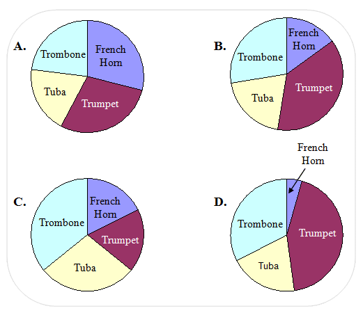
| 20) The band director then drew a circle graph from the data in the previous problems. Which of the circle graphs below represent the students playing brass instruments? |
 |
|
|
| |
|
| A scuba instructor created a circle graph to display what part of the entire class falls into each age range. Use the chart and circle graph below to answer the next two questions. |
 |
|
| |
| 21) What percent of the whole class is represented in each age range? List the percents by stating the answers for “a” through “e” in the chart. |
|
4000 character(s) left
Your answer is too long. |
|
| |
|
| 22) Determine the degree of each angle that would be used to draw each section of the pie graph by multiplying the percent, as a decimal, times 360. List the size of the angle, to the nearest whole degree, by stating the answers for “f” through “j” in the chart. |
|
4000 character(s) left
Your answer is too long. |
|
| |
|
| |
| Consider the scatter plot and then answer the next two questions. |
 |
|
| |
| 23) The scatter plot shows what type of correlation? |
|
|
|
| |
|
| 24) If the line of best fit is added to the graph, what type of slope would it have? |
|
|
|
| |
|
| 25) In September, 2010, the US Geological Survey published the scatter plot below depicting earthquakes that occurred at magnitude 5.0 or higher from 1990 to September, 2010. Looking at the data points falling above a 7.5 magnitude, draw a line of best fit from 1990 through September, 2010. Which observation about the occurrence of strong earthquakes (magnitude 7.5 or higher) from 1990 – 2010 can be made based on the graph and the line of best fit? |
 |
|
|
| |
|
| 26) Use the given data to make a scatter plot of Josh's bowling scores. What type of correlation does the scatter plot show? |
 |
|
|
| |
|
| 27) What can be deduced from the scatter plot create for the previous problem? |
|
|
|
| |
|
| Same Data in Different Graphs |
|
|
| |
| The histogram below and pie chart represent student grade point averages. Use the information from the charts to answer the next two questions. |
 |
|
| |
| 28) What grade point average range has the highest number of students? Which graph was easier to use to find the answer and why? |
|
4000 character(s) left
Your answer is too long. |
|
|
Attachments |
|
| 29) What is the total percent of students that have a grade-point average of 3.0 or higher? Which graph can be used to find the total percent more quickly and why? |
|
4000 character(s) left
Your answer is too long. |
|
|
Attachments |
|
| |
| 30) An engineering company has five employees with salaries listed in the table below. The owner places an ad as shown below and lists that the average salary of his employees as $285,000. (a) Did the owner miscalculate the average salary? (b) Why is the ad misleading? (c) What is the median salary and why would it be a more accurate report of the salaries? |
 |
4000 character(s) left
Your answer is too long. |
|
|
Attachments |
|
| 31) Compare the two lines graphs. What change was made in the second graph to show a better representation of how Karlisha’s grades were changing from week to week? |
 |
4000 character(s) left
Your answer is too long. |
|
|
Attachments |
|
| 32) The graph below represents the population of a city for three consecutive years. Select the best summary of the change in population from 2002 through 2004. Do not be misled! |
 |
|
|
| |
|
| 33) The graph below shows how the prices of baseball tickets (represented by the white balls) and volleyball tickets (represented by the blue balls) have increased from 2003 and 2004. Which statement is correct about the information displayed in the chart? Be careful, the chart is misleading! |
 |
|
|
| |
|
| 34) If you were directed by your school to complete Offline Activities for this course, please enter the information on the Log Entry form. |
|
| No offline activities found |
0 Hour(s) & 0 Minute(s)
|
|
|
Attachments |
|