GRAPHING
MOTION
Unit Introduction
In the past two units,
you learned about speed, velocity and acceleration. Your goals in this unit
include learning how to interpret and create graphs that show motion.
Interpreting Motion Graphs
Motion can be represented
by position vs. time and velocity vs. time graphs, as well as others. You can
use the graphs to discover details about the speed, direction, and change in
motion of an object.
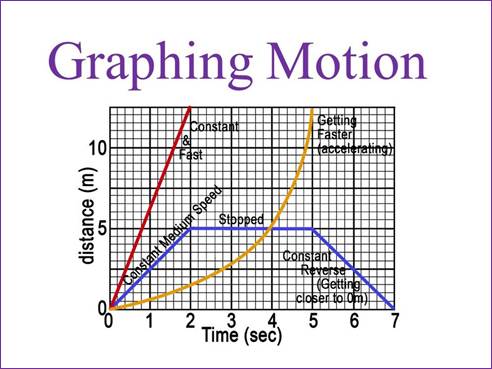
If you are graphing speed
on a position-time graph, a constant speed will be a straight line on a graph.
The slope will indicate the relative speed of the object. If the line has a
steep slope, the speed would be greater than a line that is not as steep. If
the object speeds up or slows down, you can tell by the changing slope of the
line. On the image above, an object with positive acceleration has a line that
is curving upward as its speed increases over time. If an object is not moving,
the line will be horizontal on the graph.
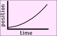
Here, the graph shows an
object speeding up, or with positive acceleration.
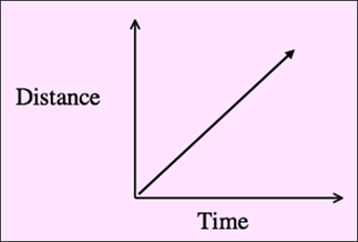
Here is an example of an
object with a constant speed shown on a graph.
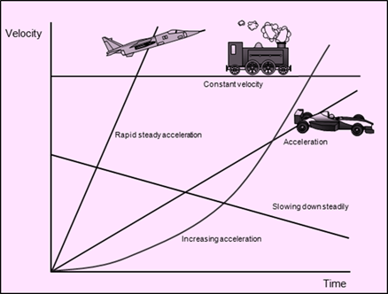
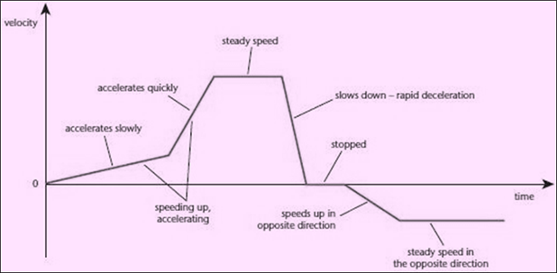
A velocity-time graph is
used to show acceleration of an object. If the line segment is pointing up from
the x-axis, it is positive acceleration. If the line segment is horizontal,
there is no acceleration (constant velocity). If the line segment is pointing
downward, it shows negative acceleration. Here is a velocity-time graph with
explanations at various points along the line segments.
Now that you may be
beginning to recognize what motion looks like on a graph, watch this video clip
to learn more about how to interpret information on a position-time graph. Take
notes and work out problems along with the video. Submit your work as question
#10 in the assessment portion of the unit.
Printable: KAHN video guide.
Once you have finished
watching the video, read this article on position-time graphs. Work out the two
examples and submit your work as question #11 in the assessment portion of the
unit.
Now, read the article at
the following website to practice interpreting velocity-time graphs. Work out
the two examples and submit your work as question #12 in the assessment portion
of the unit.
Creating Motion Graphs
When certain guidelines
are followed, it is simple to create motion graphs. Let’s start with a
position-time graph.
Recall that a
position-time graph is a way to show the average speed of an object. You can
also interpret instantaneous speed, average velocity, instantaneous velocity,
distance, and displacement from the graph.
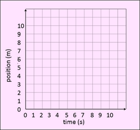
Use a sheet of graph
paper (or print one) to create some position-time graphs. You will work only in
the positive quadrant of the graphs. Label the y-axis as “position (m)” and the
x-axis as “time (s).” Write the numbers 0-10 along each axis, using one number
per square.
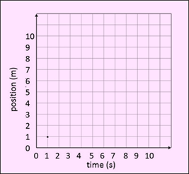
Imagine for this first
example that Todd is running at a steady pace of 1 m/s. On the graph, take your
pencil and start at 0,0. Go up to 1 meter on the y-axis, then go over to 1
second on the x-axis and draw a dot. This represents that in one second, Todd
is running one meter.
Now, since you know
Todd’s running pace, you can fill in the rest of the data in the table.
|
Time (seconds) |
Position
(meters) |
|
0 |
0 |
|
1 |
1 |
|
2 |
|
|
3 |
|
|
4 |
|
|
5 |
|
|
6 |
|
|
7 |
|
|
8 |
|
|
9 |
|
|
10 |
|
What did you come up
with? If your numbers are the same in both columns, you are correct! Todd’s pace is a steady 1 m/s, so there is no
variation and his position increases by 1 meter for every 1 second.
|
Time (seconds) |
Position
(meters) |
|
0 |
0 |
|
1 |
1 |
|
2 |
2 |
|
3 |
3 |
|
4 |
4 |
|
5 |
5 |
|
6 |
6 |
|
7 |
7 |
|
8 |
8 |
|
9 |
9 |
|
10 |
10 |
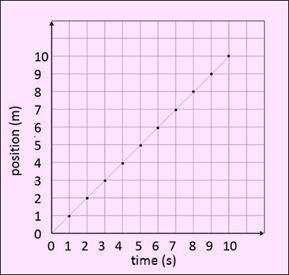
Now, you can plot the
remaining points on your graph. From the first point, go up one and over one
and place a point at 2, 2. Do the same for the rest of the points. Finally,
connect the points by drawing a straight line segment. Use a ruler or a
straight edge to make it straight and neat. Your graph should look like the one
below.
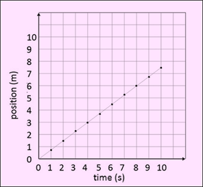
Here is a new set of data
for you to create another position-time graph.
|
Time (seconds) |
Position
(meters) |
|
0 |
0 |
|
1 |
0.75 |
|
2 |
1.5 |
|
3 |
2.25 |
|
4 |
3.0 |
|
5 |
3.75 |
|
6 |
4.5 |
|
7 |
5.25 |
|
8 |
6.0 |
|
9 |
6.75 |
|
10 |
7.5 |
Since the positions are
not in whole-meter increments, you need to approximate where the points will
land on the graph. Try to be consistent when plotting your points. Your second
graph should look like this one.
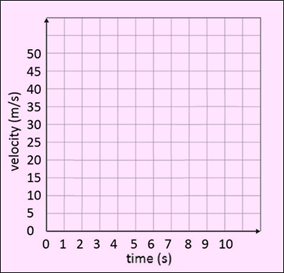
The next graph will be a
velocity-time graph to show acceleration of an object. Write “velocity (m/s)”
along the y-axis and “time (s)” along the x-axis. For every square going up the
y-axis, increase by 5 m/s. For every square going across the x-axis, increase
by 1 s.
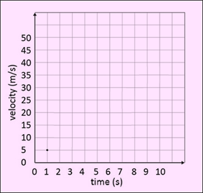
Imagine a car is
accelerating at a rate of 5 m/s2 from rest over a period of 10
seconds. In the first second, the car reaches a velocity of 5 m/s. This is how
it will look on a graph.
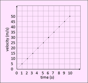
The rest of the data is
provided in the table below. Use it to complete your velocity-time graph.
|
time
(s) |
velocity
(m/s) |
|
0 |
0 |
|
1 |
5 |
|
2 |
10 |
|
3 |
15 |
|
4 |
20 |
|
5 |
25 |
|
6 |
30 |
|
7 |
35 |
|
8 |
40 |
|
9 |
45 |
|
10 |
50 |
Plot the remaining points
on your graph and draw a straight line to connect the points. When you are
finished, your graph should look like this one.
You may be starting to
wonder how a position graph differs from a velocity graph, since the lines look
very similar. Let’s take the data from the velocity graph and reinterpret the
data to more closely examine the speed of the car over time, rather than the
acceleration. To do that, we will use the data to create a position graph. If
the car accelerates by 5 meters per second every second, fill in the next table
accordingly. Remember: velocity is increasing every second, so the position
will be increasing exponentially.
|
Time (s) |
Velocity (m/s) |
Position (m) |
|
0 |
0 |
0 |
|
1 |
5 |
5 |
|
2 |
10 |
15 |
|
3 |
15 |
|
|
4 |
20 |
|
|
5 |
25 |
|
|
6 |
30 |
|
|
7 |
35 |
|
|
8 |
40 |
|
|
9 |
45 |
|
|
10 |
50 |
|
You may have noticed a
pattern that if you add the number in the velocity column to the past position,
you get the new position. So, if the last position was 15m, and the next
velocity is 15m/s, the new position is 30m. Check your work with the table
below to see if you got the correct answers.
|
Time (s) |
Velocity (m/s) |
Position (m) |
|
0 |
0 |
0 |
|
1 |
5 |
5 |
|
2 |
10 |
15 |
|
3 |
15 |
30 |
|
4 |
20 |
50 |
|
5 |
25 |
75 |
|
6 |
30 |
105 |
|
7 |
35 |
140 |
|
8 |
40 |
180 |
|
9 |
45 |
225 |
|
10 |
50 |
275 |
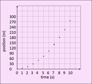
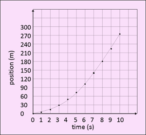
Since the position values
increase greatly, create the y-axis for position up to 300m. The time on the
x-axis goes up to 10s. Plot your data points. Notice that the shape will be a
line that curves upward to indicate the increase in velocity, or positive
acceleration.
Once the line is drawn,
your graph will look something like this one.
Now that you have some
practice on creating position-time and velocity-time graphs, you can complete the
next activity.
