SCATTERPLOTS AND INTERPRETING GRAPHS 
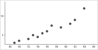
Scatter plots are used to illustrate how two variables relate to each other by showing how closely the data points cluster to a line (line of best fit). Scatter plots can be used to predict relationships between two sets of data, such as those related to weather. Lastly, you will also learn about 2-way frequency tables. |
Scatter Plots
|
*Watch this video to learn more about correlation and causality:
Please pay attention in this video to whether something can have a positive correlation but one thing not cause another! There will be questions about this! Stop! Go to Questions #1-8 about this section, then return to continue on to the next section.
|
Line of Best Fit |
|
Watch this video for an example where this may happen: Click on the link to watch the video "Comparing models to fit data" or click on the video. Practice answering questions about these types of scatterplots: Fitting quadratic and exponential functions to scatter plots.
Stop! Go to Questions #9-20 about this section, then return to continue on to the next section. |
2-Way Frequency Tables *Watch this video on creating 2-Way Frequency Tables. Please watch the introduction so you know what the data is. Then you may fast forward (as we are not discussing Venn Diagrams at this time) to time 3:36 on the video. Then watch to the end. Click on the link to watch the video "Two-way frequency tables and Venn diagrams" or click on the video. |
Try this! Fill in the table with the relative frequencies. Use the data above.
|
To practice understanding two-way frequency tables, please go to: Two-way relative frequency tables
For practice interpreting two-way tables, please go to: Interpreting two-way tables |
Stop! Go to Questions #21-36 to complete this unit. |
Scatter Plots |
Graph Comprehension |