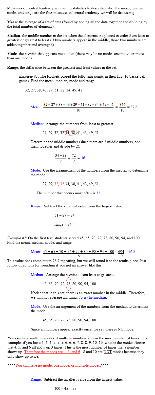
Measures of Central Tendency
Stop! Go to Questions #1-8 about this section, then return to continue on to the next section.
| PDF STATISTICS AND GRAPHS Unit OverviewThis unit is about statistics and graphs that help organize data. Graphs are important because they can be used to present large amounts of information in ways that are easily understood. Graphs are used to summarize, analyze, and interpret data in many different types of settings and work places. |
Measures of Central Tendency Stop! Go to Questions #1-8 about this section, then return to continue on to the next section. |
Dot Plots
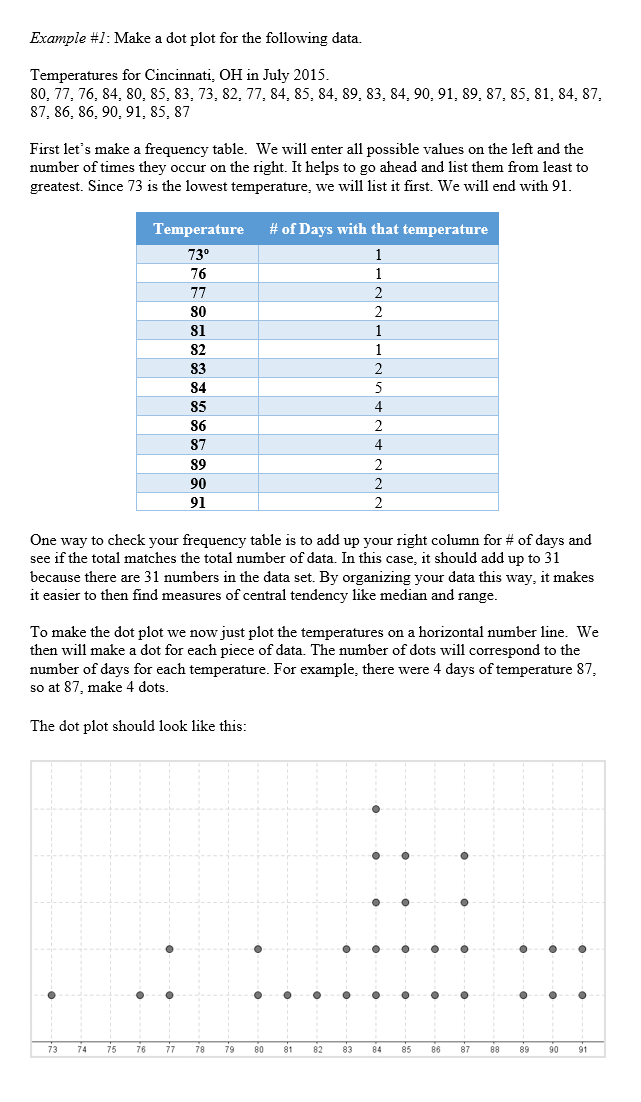
Watch this video explaining frequency tables and dot plots: Click on the link to watch the video "Frequency tables and dot plots" or click on the video.
|
 |
| Stop! Go to Question #9 about this section, then return to continue on to the next section. |
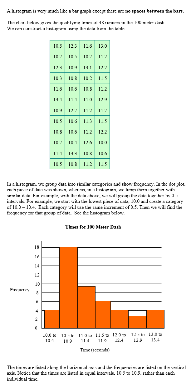
Histograms
|
| *Watch this video for further explanation on making histograms: Click on the link to watch the video "How to create a histogram" or click on the video.
Stop! Go to Questions #10-16 about this section, then return to continue on to the next section. |
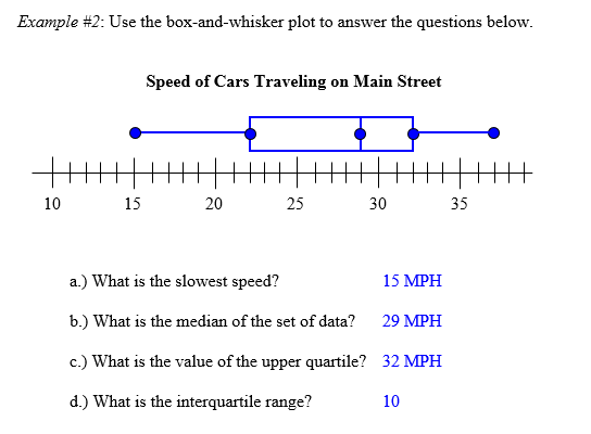
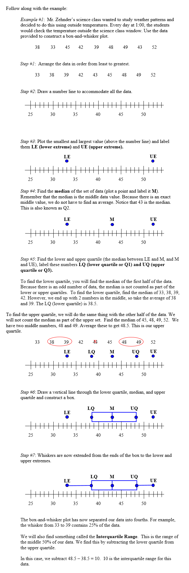
Box-and-whisker Plot A box-and-whisker plot is a method of showing how data is distributed using the median, upper and lower quartiles, and the greatest and least values known as extremes. In this unit, you will be responsible for interpreting and creating box-and-whisker plots. However, to fully understand box-and-whisker plots, we will go through step by step instructions on how they are constructed. Recall that the median of a set of data is the number in the center when the data is ordered from least to greatest. Basically, the median separates the data in half. The median of the lower half of the set of data is called the lower quartile. The median of the upper half of the set of data is called the upper quartile. The inter-quartile range is the range of the middle half of a set of numbers and is found by finding the difference between the upper quartile and the lower quartile. *Watch this video for an introduction to box and whisker plots: Click on the link to watch the video "Box and whisker plot" or click on the video. |
 |
*Watch this video for help constructing a box-and-whisker-plot: Click on the link to watch the video "Constructing a box and whisker plot" or click on the video. |
|
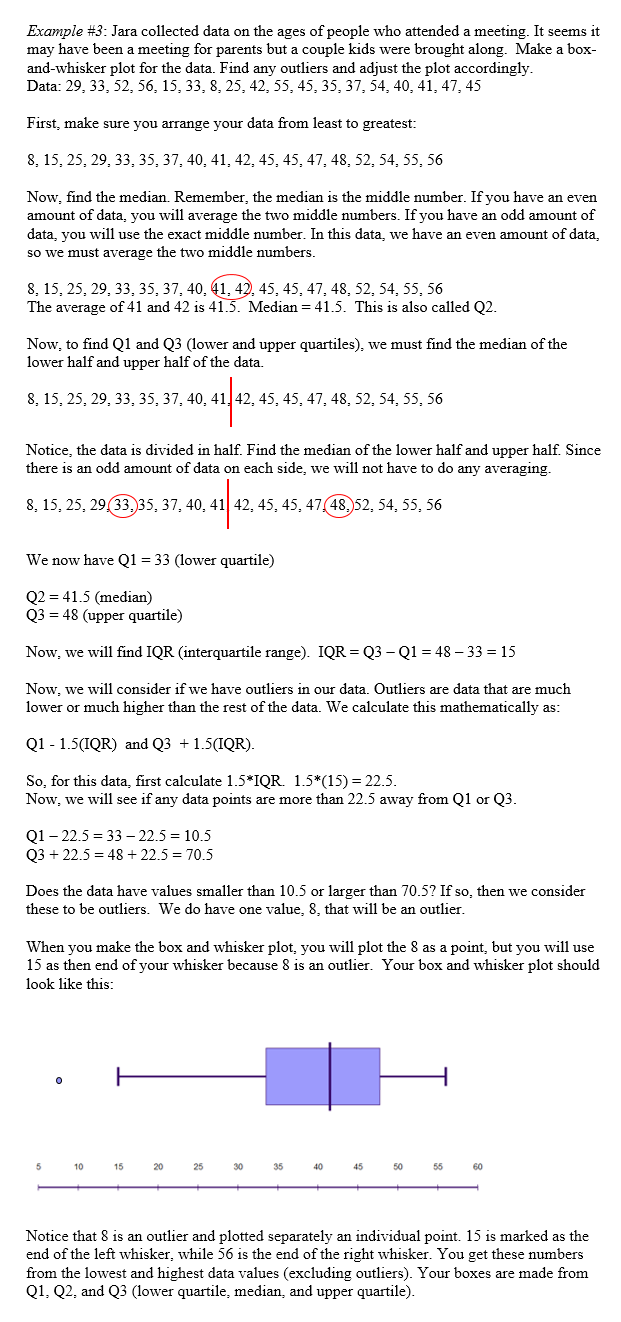
You may also encounter data that may have outliers. Outliers are data that do not easily fit with the rest of the data. For example, if you measured all of the students in the class as well as your teacher, you may find that most of the data is similar (all of the students) but you may have an outlier (the teacher's height). When outliers exist, we plot them on the horizontal number line but do not connect them to the box and whisker plot. Outliers are data that are much lower or much higher than the rest of the data. We can calculate outliers mathematically this way: data < Q1 – 1.5 × IQR or data > Q3 + 1.5 × IQR. Q1 is the lower quartile, Q3 is the upper quartile, and IQR is the Interquartile Range. |
Watch this video regarding outliers:
|
 |
Stop! Go to Questions #17-30 to complete this unit. |
 |
| Box and Whisker Plots |
| Center and Spread of Data |
| Visualizing Data |
| Using Statistical Models |