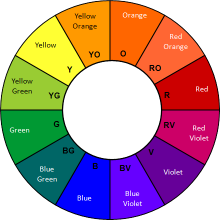
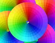
PDF File

THE ELEMENTS OF ART – PART 2


Unit Overview


Imagine for a minute, a world without color.  Everything would look dull and lifeless.  There would be no excitement or variety to our surroundings.  This is exactly why color is so very important to artists.  Color adds life to their artwork and enhances its beauty.  To some artists, color is the most important element they use.  It is the element that is derived from reflected light.
           
When most people think of color they think of a rainbow or the color spectrum.  In art, we think of a color wheel.  Sir Isaac Newton organized the colors of the rainbow into a circle, or wheel, in the eighteenth century.  The color wheel is made of twelve colors.  Each of these colors fit into one of three categories – primary, secondary and tertiary or intermediate colors.  The primary colors are red, yellow and blue.  These are the most important colors on the wheel because they can make all of the other colors.  The secondary colors are orange, green and violet.  They are made by mixing the primaries together.  The tertiary or intermediate colors are red-violet, blue-violet, blue-green, yellow-green, yellow-orange, and red-orange.  They are made by mixing one primary and one secondary color together.


The Color Wheel


Color Theory


Most people think that in order to create colorful paintings they must buy many, many different colors of paint.  This is not true.  If you understand color theory, or the way colors can be combined and used together, then you would know that you really only need to buy five colors.  They are red, blue, yellow, black and white.  When mixed properly, these five colors will allow you to create just about every color you’ll ever need. 

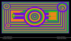
Color theory is based on three properties or ideas; they are hue, value and intensity.  
 
  • HUE IS THE NAME OF A COLOR, OR THE WAY WE IDENTIFY COLORS.
 
  • VALUE IS THE LIGHTNESS OR DARKNESS OF A COLOR.  A COLOR’S VALUE CAN BE CHANGED BY ADDING BLACK OR WHITE TO IT.  ANY COLOR WITH WHITE ADDED TO IT IS A TINT.   ANY COLOR WITH BLACK ADDED TO IT IS A SHADE.  BLACK AND WHITE (AND SHADES OF GRAY) ARE CALLED NEUTRAL COLORS.
 
  • INTENSITY IS THE BRIGHTNESS OR DULLNESS OF A COLOR.  A COLOR’S INTENSITY CAN BE LOWERED BY ADDING THE COLOR THAT IS DIRECTLY ACROSS FROM IT ON THE COLOR WHEEL.  THIS IS ITS COMPLEMENTARY COLOR.   YOU CAN NOT RAISE A COLOR’S INTENSITY.  IT IS AT ITS BRIGHTEST RIGHT OUT OF THE TUBE OR JAR.


Color Schemes


Should I paint this flower red or yellow?  Should I color this dog brown or black?  Should I wear my blue shirt or my green shirt?  Every time you pick a color you are making a choice.  Some colors seem to look better together than others.  When artists choose their colors they are creating a color scheme.  There are many different schemes to use, but the ten most common ones are listed below.

10 MOST COMMON COLOR SCHEMES
   

1.  Monochromatic - using one color plus black and white.  This will allow you to create many different tints and shades of the color that you choose.

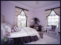
2.  Warm Colors - using reds, yellows, and oranges

3.  Cool Colors - using blues, greens and violets

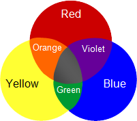
4.  Primary Colors - using red, yellow and blue

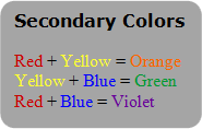
5.  Secondary Colors - using orange, green and violet

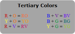
6.  Tertiary Colors - using RO, YO, YG, BG, BV, and RV

7.  Analogous Colors - using any 3 colors that touch each other on the color wheel (ex. Yellow-orange, orange and red-orange)

8.  Triadic Colors - using colors that are equally spaced apart from each other on the color wheel  (ex.  Blue-violet, yellow-green and red-orange)

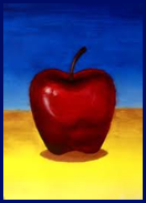
9.  Complementary Colors - using any two colors that are across from each other on the color wheel  (ex. Blue and orange)

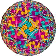
10.  Color Spectrum - using all the colors of the rainbow


Texture


Run your fingers across your computer screen.  How does it feel?  Smooth?  Slick?  Now run your fingers across the tread of your shoes.  How does that feel?  Rough?  Bumpy?  Texture is the way an object feels or looks like it would feel.  We understand texture through our senses of sight and touch.  Sometimes an object feels exactly as it looks.  For instance, sandpaper looks very rough, maybe even rugged; and when you actually rub your fingers across a piece of it, the feeling you get matches the way it looks. 


Other things may look one way but feel quite different.  Have you ever shopped for a soft sweater only to take it to the fitting room to discover that it was very itchy? 


We need both of our senses to fully understand an object’s texture.
           
Artists show texture in their art by using various tools and techniques.  Texture in sculpture can be achieved by rubbing or buffing the work until it is very smooth, or scratching and chiseling a piece until the surface is rough or bumpy.  Texture that is real is called actual texture.


Texture in two dimensional art can be real or it can be an illusion.  Some painters apply their paint in very thick layers in order to produce a surface that feels rough when you touch it. 


Other artists use highlights and shadows, or perhaps they may use patterns to create a visual texture.  These paintings might look very rough but if you were to touch them, they would feel smooth. 


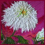
By using either actual or visual texture, your work will become more interesting to the viewer.


Below are additional educational resources and activities for this unit.

Unit 3 Resource 1

Unit 3 Resource 2