 |
Unit Objective
●
Comparing populations using measures of center and variation.
●
Measures of center- mean, median, Interquartile range, and mean
Absolute deviation (MAD).
Key Vocabulary
·
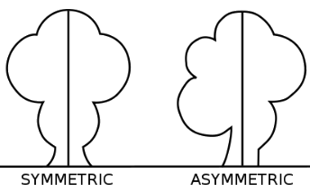
Symmetric - the same on both
sides of the center
·
Asymmetric means not symmetric
·
Skewed - more to one side of center
Box-and-Whisker Plot
Mean Absolute Deviation(MAD)
Comparing Populations
Use the mean and the mean absolute deviation (MAD) to compare
populations when both distributions are symmetric.
Use the median and the Interquartile range (IQR) when one or
both distributions are skewed.
In the following example (example 1) the distributions are skewed. Therefore,
we use median and IQR.
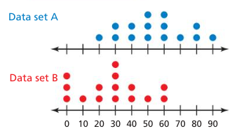
Example 1: Two data sets contain
an equal number of values. The double box-and-whisker plot represents the
values in the data sets.
 |
a) Compare the data sets using measures of
center and variation.
Both distributions are skewed. Use the median
and the IQR.
| Data set A | Data set B | |
| Median = 60 | Median = 90 | |
| IQR = 80 – 30 = 50 | IQR = 100 – 80 =
20
|
So, Data set B has a greater measure of center,
and Data set A has a greater measure of variation.
|

b) Which data set is more likely to contain a
value of 95?
About 25% of the data values in Data set A are between 80 and 130.
About 50% of the data values in Data set B are between 80 and 100.
So, Data set B is more likely to contain a value of 95.
c) Which data set is more likely to contain a value that differs
from the center by at least 30?
The IQR of Data set A is 50 and the IQR of Data set B is 20.
This means it is more common for a value to differ from the center by 30 in
Data set A than in Data set B.
So, Data set A is more likely to contain a value that differs
from the center by at least 30.
Let's practice.
1)
Which data set is more likely to contain a value of 70?
 |
2)
Which data set is more likely to contain a value that differs from center by no
more than three?
 |
Describing Visual Overlap

When two populations have similar variabilities, the
visual overlap of the data can be described by writing the differences in the
measures of center (mean, median) as a multiple of s measure of variation (MAD).
Example 1: The double dot plot
shows two data sets. Express the difference in the measures of center as a
multiple of the measure of variation.
 |
Both distributions are approximately symmetric. Use the mean and the MAD to describe
the centers and vartaions.
 |
So, the
difference in the means is about 1.6 times the MAD.
Let's practice.
WHAT IF? Each value in the dot plot for Data set A increased by 30.
How does this affect your answers. Explain.
When the difference in
measures of center is at least two times the measure of variation, the
difference is significant.
Modeling Real Life
 |
The double box-and-whicker plot represents the
heights of rollercoasters at two amusement parks. Are the rollercoasters significantly
taller at one part than at the other park?
 |
The distribution for Park A is skewed, so use the
median and the IQR to describe centers and variations.
| Park A | Park B | |
| Median = 50 | Median = 55 | |
| IQR = 55 – 45 = 10 | IQR = 60 – 50 =
10
|
Because the variabilities are similar, you can
describe the visual overlap by expressing the difference in the medians as a
multiple of the IQR.
 |
Because the quotient is less than 2, the difference
in the medians is not significant.
The rollercoasters are not significantly taller at one park than at the other
park.
Let’s Practice.
The double box-and-whisker plot represents the
weights of cats at two shelters. Are the cats significantly heavier at one
shelter than at the other? Explain.
 |
|

 |